
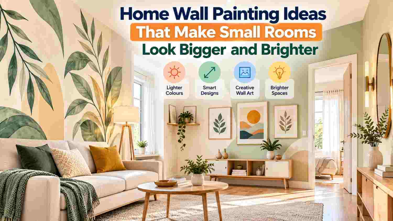
However, artwork size, colour combinations, and placement influence how spacious a room appears. Light compositions, balanced arrangements, and suitable framing help small Indian homes look open and comfortable.
How Wall Paintings Make Small Rooms Appear Larger?
Wall paintings influence spatial perception through colour, composition and visual continuity. Although artwork cannot increase physical dimensions, suitable designs can create an impression of openness.
Paintings featuring distant landscapes encourage viewers to look beyond foreground elements. Similarly, minimalist compositions reduce visual distractions and support a calmer interior.
Consider these principles:
-
Visual continuity: Coordinate artwork colours with surrounding walls.
-
Negative space: Select compositions with uncluttered backgrounds.
-
Balanced proportions: Match painting dimensions with available wall space.
-
Controlled contrast: Introduce focal points without excessive visual competition.
Consequently, thoughtful artwork selection can make compact interiors appear more balanced.
Best Wall Painting Colours for Small Rooms
Colour influences perceived brightness, visual warmth and the relationship between decorative elements.
Light Neutral Colours
Soft white, ivory, beige and cream paintings complement compact interiors. Their restrained palettes create visual continuity with similarly coloured walls.
Moreover, neutral artwork pairs comfortably with wooden furniture, upholstered seating and patterned curtains.
Pastel Blue and Green
Pale blue suggests openness, particularly in paintings featuring skies, coastlines or distant mountains.
Meanwhile, gentle green botanical artwork introduces natural character without overwhelming surrounding decoration.
Soft Grey and Earthy Shades
Light grey compositions suit contemporary interiors featuring neutral furniture.
Alternatively, muted terracotta, sand and warm brown accents complement traditional Indian residential decor.
Darker colours can also work effectively when surrounding walls provide sufficient visual balance.
Painting Themes That Create Visual Depth
Different artistic compositions influence how viewers perceive distance, height and openness.
Landscape and Nature Paintings
Landscape paintings featuring distant horizons can make walls appear visually deeper.
Mountain scenery, coastal views, and open skies provide useful compositions for compact living rooms.
Minimalist Abstract Paintings
Abstract artwork with simple shapes and generous empty areas supports uncluttered interiors.
For example, flowing lines and restrained geometric patterns introduce movement without excessive detail.
Botanical and Architectural Artwork
Tall botanical compositions draw attention upwards, potentially reinforcing the impression of ceiling height.
Similarly, architectural paintings featuring corridors or distant pathways introduce perspective.
However, heavily detailed artwork may appear visually crowded against patterned walls.
Choosing the Right Painting Size
Painting dimensions should complement wall proportions, furniture width, and viewing distance.
A single appropriately sized painting often creates greater visual simplicity than numerous unrelated decorative pieces.
Before selecting artwork, consider:
-
Measure available wall width and height.
-
Compare painting dimensions with nearby furniture.
-
Allow sufficient space around frames.
-
Consider frame thickness and overall visual weight.
-
Assess visibility from normal seating positions.
For narrow walls, smaller vertical paintings may provide better proportions than oversized horizontal compositions.
Vertical Versus Horizontal Wall Paintings
Artwork orientation influences visual direction and perceived room proportions.
Vertical paintings encourage upward eye movement, making them suitable for compact bedrooms, narrow hallways and walls beside wardrobes.
Horizontal paintings reinforce apparent width, particularly above sofas, dining benches and low furniture.
Furthermore, panoramic landscapes can create visual continuity across wider walls.
Choose orientation according to existing architecture rather than following decorative trends.
One Large Painting or Multiple Small Paintings?
One statement painting creates a defined focal point while preserving surrounding wall space.
In contrast, coordinated gallery arrangements offer decorative variety but require careful spacing.
For compact rooms, gallery walls work best when frames share complementary colours, consistent proportions and a clear arrangement.
Avoid combining numerous competing themes, particularly near televisions, shelves or heavily patterned upholstery.
Wall Painting Ideas for Different Rooms
Each residential space requires artwork that complements its furniture, lighting and primary function.
Small Living Rooms
Position a landscape or abstract painting above the sofa.
Choose colours that complement upholstery while maintaining sufficient contrast against the wall.
Compact Bedrooms
Select calming botanical compositions, soft landscapes or minimalist artwork.
Above-bed paintings should complement headboard dimensions without visually dominating the sleeping area.
Small Dining Areas
Choose modest artwork featuring balanced colours and restrained detail.
Position paintings where furniture and decorative accessories do not compete for attention.
Narrow Hallways
Vertical paintings and perspective-based artwork suit limited wall widths.
However, excessive framing can make narrow corridors appear visually congested.
Studio Apartments
Maintain consistent artwork colours across sleeping, dining and living zones.
This approach creates continuity between areas serving different purposes.
Small Home Offices
Choose simple geometric compositions or restrained nature artwork.
Avoid visually distracting paintings directly behind frequently used workstations.
Lighting and Colour Coordination
Lighting influences how painting colours appear throughout the day.
Natural daylight can emphasise subtle colour differences, while artificial lighting may alter perceived warmth.
Consider these practical adjustments:
-
Position artwork away from harsh direct sunlight.
-
Reduce glare from glass-covered frames.
-
Coordinate painting undertones with curtains.
-
Compare colours under existing room lighting.
-
Avoid dark corners without adequate illumination.
Additionally, simple frames often complement compact interiors better than heavily ornamented alternatives.
Affordable Painting Ideas and Buying Considerations
Budget-conscious decoration begins with careful planning rather than purchasing additional accessories.
Reposition existing artwork, simplify decorative arrangements, and prioritise one suitable focal painting.
Before homeowners buy home wall painting online in India, they should compare product dimensions, canvas materials, framing, mounting requirements, and return conditions.
Check product photographs carefully because screen settings can affect colour representation.
Also consider packaging quality, artwork weight, and wall compatibility before purchasing.
Common Wall Painting Mistakes to Avoid
Several decorating choices can unintentionally make compact interiors appear crowded.
-
Hanging oversized paintings without measuring available space.
-
Combining unrelated colours across neighbouring walls.
-
Selecting bulky frames for narrow corridors.
-
Filling every empty wall with decorative pieces.
-
Ignoring furniture alignment and lighting conditions.
Instead, review arrangements from the room entrance and normal seating positions.
Conclusion
Suitable wall paintings complement room proportions, lighting conditions and existing decorative elements.
Prioritise balanced dimensions, coordinated colours and compositions that create visual depth.
Before final placement, assess artwork from different viewpoints and preserve sufficient surrounding wall space.
Thoughtful selection helps compact interiors maintain brightness, character and visual harmony without unnecessary decoration.